
SHORT USER MANUAL FOR Generator
Table of contents:
Intro to Generator
1.3 What are Rows, Columns and Modules
1.4 How do Rows Work
1.5 How do Columns Work
1.6 How do Modules Work
1.7 Spacing
1.8 Borders
1.9 Background
1.10 How does Viewports work
1.11 Column Width Change
1.12 Hiding Modules
1.13 Rollback Function
1.14 Reset Function
General Settings
2.1 Editor Language
2.2 Google Page Speed
2.3 Date and Formats
2.4 Google Analytics
2.5 Favicon
2.6 Cookie Notification
Content
Previewing & Publishing
Pages & Content
BLog
6.1 Blog Fundamentals
6.2 Add New Post
6.3 Blog SEO
6.4 Add & Manage Category Tags
6.5 Blog Catalog Module - Content
6.6 Blog Catalog Module - Settings
Apps
Intro to Generator
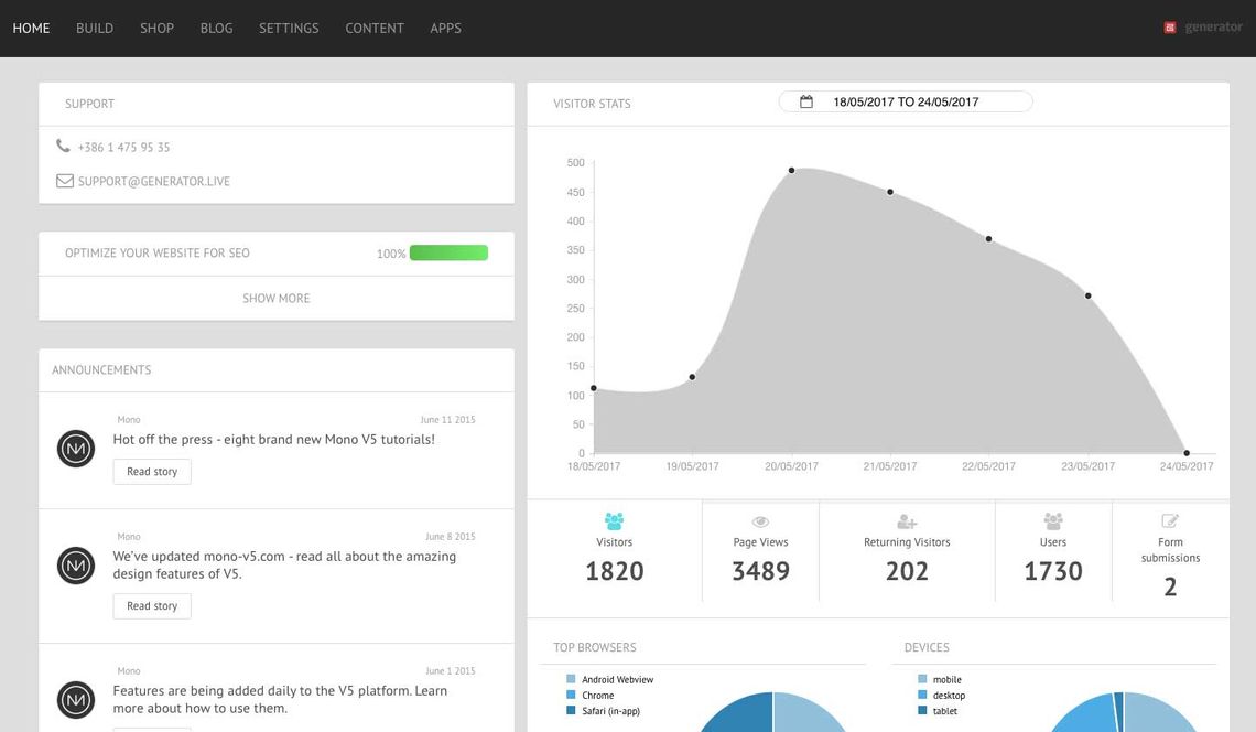
1.1 Home
Home is the first area of the high-level editor interface you see after logging in.
Home provides you with an interactive overview of visitor traffic, SEO recommendations for specific pages, latest announcements and contact information for your support team. Please note, this can look different depending on your account configuration.
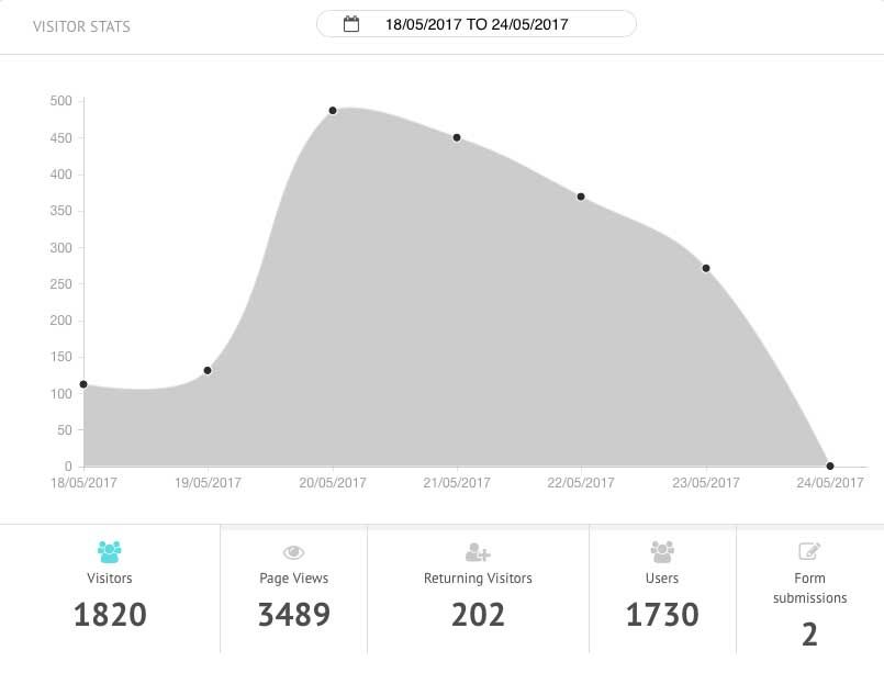
REPORTING STATS
- Visitor stats - Get a full overview of your website traffic from Google Analytics under Visitor Stats. You may break down the stats by clicking on the visitor fields under the stats curve
- Form submissions - Get statistics on how many forms on your website are submitted in a given time period
- Top pages - View your most visited pages to get an understanding of which content is most popular and relevant to your visitors
- Top Actions - Check which buttons are most frequently clicked, including form submissions
- Top browsers - See which browsers are the most popular amongst your site vis
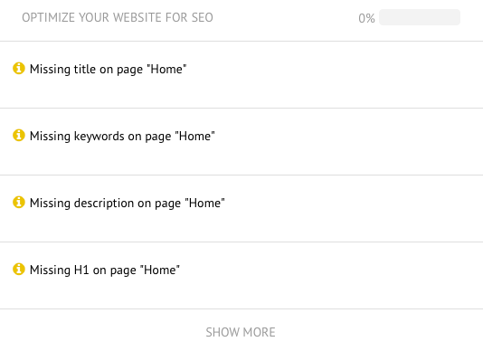
SEO - OPTIMIZE SEO
Get an overview of how optimized your website content is for search engines. This small teaser interface offers you an overview of your basic on-page website SEO for individual pages to help you optimize your SEO tags accordingly.
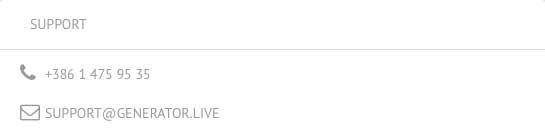
SUPPORT - WE'RE HERE TO HELP
If you ever need help we have made it easy to contact your support team. You can find the support information in the top left corner of your Home page.
1.2 Build
Build is the second tab in the high-level editor interface and is likely where you'll spend most of your time. Build provides you with all the tools necessary to add and alter the content and design of your website, choose themes and modify global styling. Please note that these sub sections of Build may be different based on your account configuration.
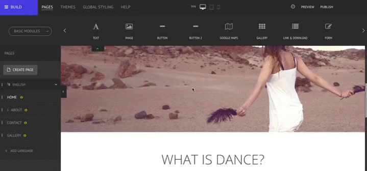
PAGES
In the Pages area you will be able to create new pages, add or modify content and make local design changes, among other options. To learn more about pages, please click here.
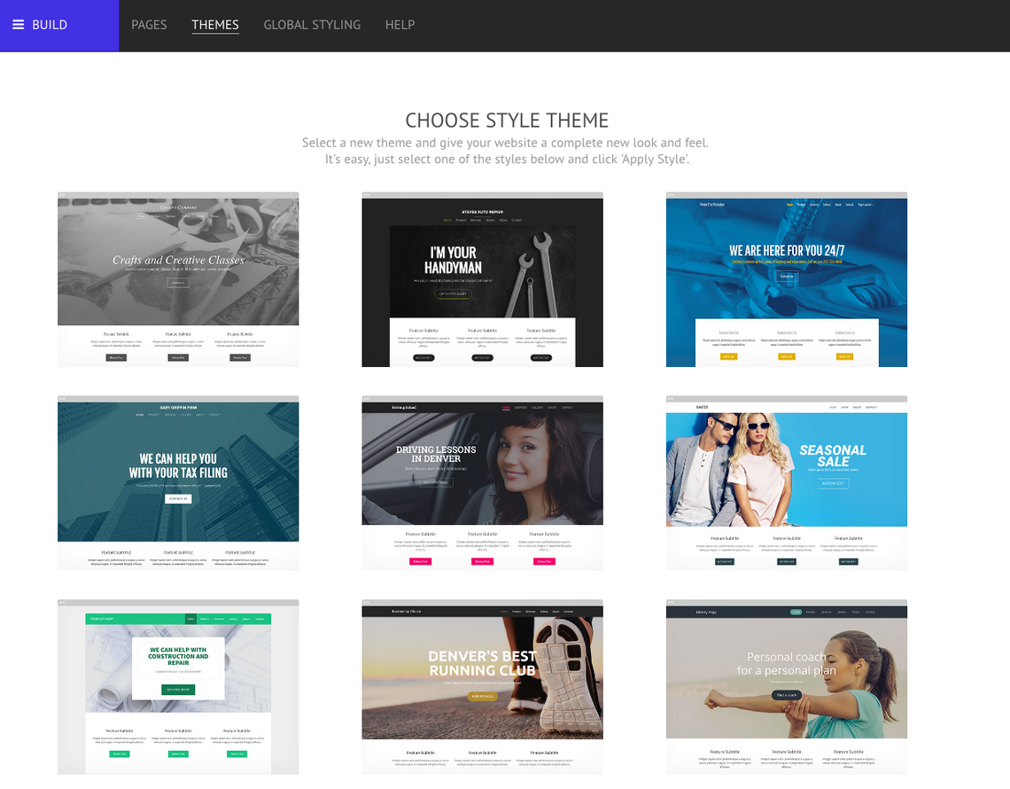
THEMES
In the Themes area you can easily choose to apply a new design theme to your website among a library of many different looks. The themes should help you with designing a professional and sophisticated website in no time, since major elements like layout settings, headers including menu, and other design elements are pre-defined for your convenience. After you have applied a theme, you can easily change the overall look and feel of your website by using Global Styling, specially Global Colors and Global Font. Click here to learn more about Global Styling!
GLOBAL STYLING
In the Global Styling area you can apply global changes to your website, including the design of the header and footer. To learn more about Global Styling, please click here.
By clicking on Help you'll be redirected to a support page with different FAQs and tutorials that will allow you to discover the full potential of the editor.
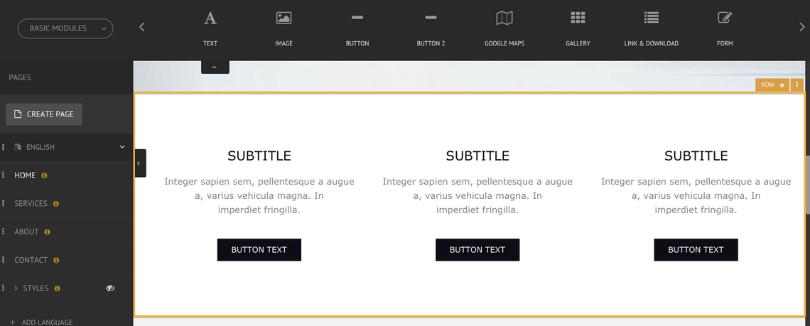
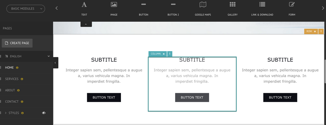
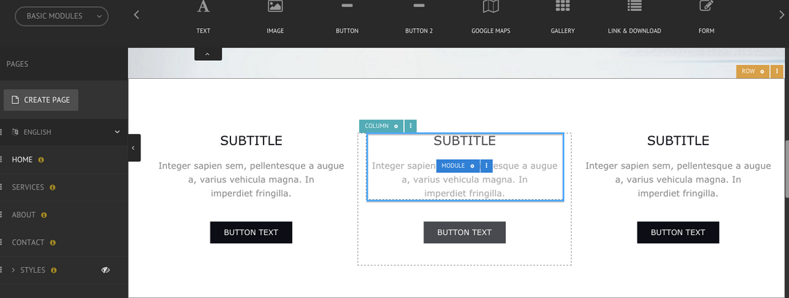
1.3 What are Rows, Columns and Modules
When in the Build area, rows are highlighted in orange, columns in green and modules in blue. Rows are comprised of up to twelve columns and these columns contain the modules.
DELETING A COLUMN
To delete an existing column, click on the green Column menu and select Delete. The remaining column(s) should automatically fill the space left by the one deleted.
IMPORTING CONTENT TO A COLUMN
Instead of manually adding the content, the editor gives you the possibility to import content from existing websites and add it to your own, automatically adding the relevant modules to a column. Learn all about importing content here!
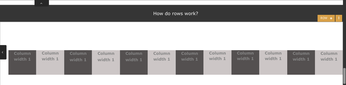
1.4 How do Rows Work
A row is created by either copying an existing row or by dropping a new module onto the page in a green highlighted area. Rows can be made fluid (spanning the entire width of the browser) or fixed to the body area width. Rows have individual styling options including spacing, margin and background (including images and videos). They can also be made into groups to create a slider (or carousel) effect on the site. By default, when creating a new row it will comprise of only one column, which you can read more about under the columns section below.
CREATE A NEW ROW
To create a new row, simply drag a module into the page and drop it into a green highlighted area on the page. A row with one column containing that selected module will be created. Alternatively, you can copy and paste an existing row.
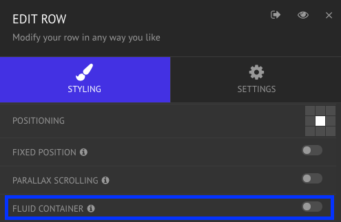
FIXED AND FLUID ROWS
A row can be defined as fixed or fluid. A fixed row ensures that the content is always centered in a fixed width even if the screen is wider than the content; a fluid row allows the content to stretch to the entire width of the browser, independently from the size of the screen. It is possible to have rows with different settings on the same page.
To turn a fixed row into a fluid row, click on the gold Row menu and select Edit. In the Styling tab, enable the Fluid Container option and click on Save.
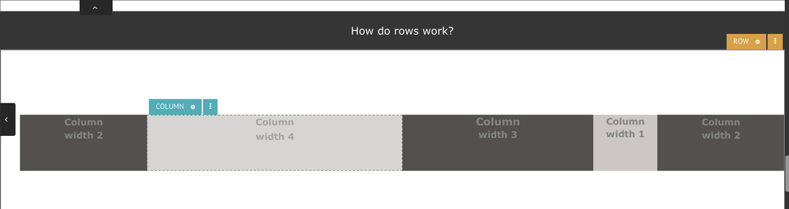
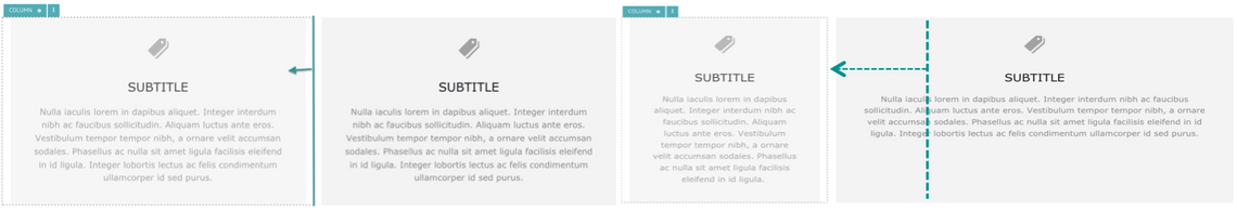
1.5 How do Columns Work
By default a new row always starts with one column. You can then split the column in order to create multiple columns. You can change the width of any column within a row by dragging the left or right side bar of the column. A row can contain up to twelve columns. Each column must have a width between 1 to 12 units, as long as they always add up to 12. For example, you can have two columns with the width of 6 units each or multiple columns with different widths adding up to 12. Columns also have their own margin, spacing and a number of other style elements including backgrounds, borders, etc.
ADDING A NEW COLUMN
To add a new column, click on the green Column menu and select Split. It is possible to repeat this process as many times as you like but keeping in mind that the maximum number of columns is 12.
CHANGING THE WIDTH OF A COLUMN
It is easy to change the width of a column by dragging the edges of the column in the direction wanted.
DELETING A COLUMN
To delete an existing column, click on the green Column menu and select Delete. The remaining column(s) should automatically fill the space left by the one deleted.
IMPORTING CONTENT TO A COLUMN
Instead of manually adding the content, the editor gives you the possibility to import content from existing websites and add it to your own, automatically adding the relevant modules to a column. Learn all about importing content here!
1.6 How do Modules Work
Once you have set up a column, you can drag modules into it. You can find the modules along the top of the editor. Choose the module category from the drop down menu - All Modules, Basic Modules and Social Modules - and then use the side arrows to navigate. You can stack as many modules in a column as you want. To see all the modules, please click here.
MODULE GROUPS
In addition to the individual Basic modules, there are pre-designed Module Groups which make a page more functional and sophisticated while at the same time facilitating the design and layout by having modules already grouped in a relevant way. All modules are already customized to stack and collapse effectively in each of the three viewports, which makes them time efficient to use. See the Module Groups that the editor offers here.
1.7 Spacing
When styling rows, column or modules, there are two spacing settings available - Margin and Padding. To change the spacing, go to the menu of the element you are working on and find the Spacing option.
MARGIN
Margin adjusts the space outside of an element.
PADDING
Padding adjusts the space inside of an element.
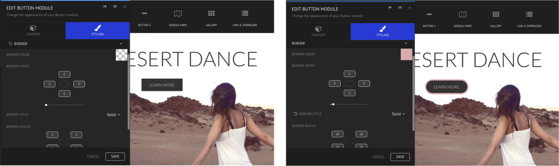
1.8 Borders
There are multiple elements in which you can customize borders, including rows, columns, and modules like text, buttons or images. To add or change borders, click on the element, choose Edit and find the Border option under the Styling tab. When customizing borders, the following options are available: color, width, style and radius.
COLOR AND WIDTH
These options allow the alteration of the color and pixel width of the border.
STYLE
There are 8 different border styles which can be chosen from the drop down menu - solid, dotted, dashed, double, groove, ridge, inset and outset.
RADIUS
This option allows you to round the corners of the element.
GENERAL EXAMPLE:
In the image below it is possible to see the full customization of a button's border:
1.9 Background
There are two options when changing an element's background - choose a solid color or upload an image from the library. To change the background, select the menu of the element, choose Edit and find the Background option.
BACKGROUND MEDIA
When choosing an image as a background, there are a lot of variables to take into account depending on the image's composition, size, type, etc.
Repeat
You can use this to repeat a background image, vertically, horizontally or both ways. Bear in mind if your background is set to cover, contain, or is larger than the area of the container, then you may not see the background repeating.
Size
Regarding size, there are three options:
Normal - keeps the picture at its normal size.
Cover - the image will expand to fill the container but not repeat itself.
Contain - the image will scale and repeat to fill the container.
Positioning
Positioning allows the placement of the picture as desired, making visible the portion of the image that is intended.
Fixed Position & Parallax Scrolling
When Fixed Position is enabled, the picture won't move while a user is scrolling on the page. When Parallax Scrolling is enabled, the picture will 'move' (different areas of the image become visible) as the user is simultaneously scrolling, following the scrolling direction but moving at a different rate to the scroll speed.
Background Clip
Enabling this option will clip the background image based on the padding settings. The larger the padding, the more the background image will be clipped.
BACKGROUND VIDEO
It is possible to have a video automatically playing (set to repeat/loop) as the background of a row or column.
Enable Background Video
You should select this option if you want to display a video as the background for the row or column. The video won't play unless you enable this option.
Video URL
Paste the link of the video you wish to add as a row background. Please note that the only accepted URLs are: MP4, WEBM, OGG, YouTube and Vimeo.
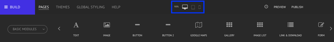
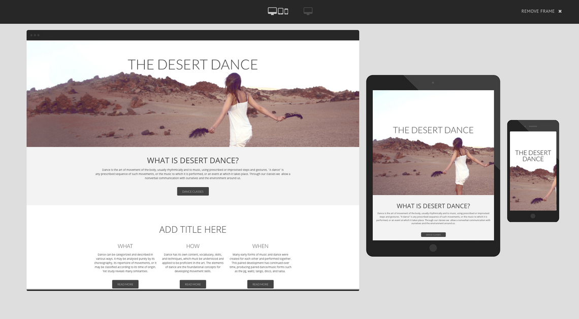
1.10 How does Viewports work
The editor allows for the design of truly responsive websites, optimizing them for the three most important viewports - desktop, tablet and mobile. These viewports can be uniquely designed and contain unique content for the particular viewport without ever compromising the source code which remains a single page of HTML. Watch the video below for a quick tutorial on the topic!
One of the main differences between these viewports is their width. The tool makes it possible to design a website that looks good across the different viewports as it is possible to adjust the columns without changing their content.
You can change between viewports by selecting one of the three different icons on the top of the editor interface.
1.11 Column Width Change
What may look well designed on the desktop view may look poor on the mobile device view. Therefore, in order to keep the images visible and the text readable, it is important to adjust the column width between viewports to improve the user experience. To an extent, this happens automatically based on responsive design. However, you have the option to further customize column width based on viewport if you think a different width works better for your content.
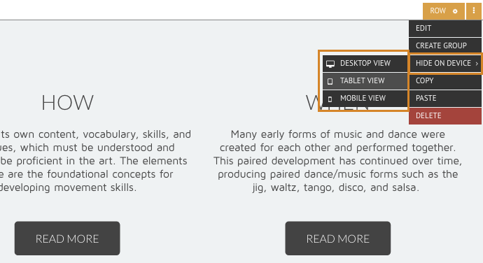
1.12 Hiding Modules
Sometimes it makes sense to hide specific elements in different viewports. To do so, click on the row or module you wish to hide, select the Hide on Device option and choose in which viewport you wish to make that element invisible.
For example, this feature can be particularly handy if you wish to display a phone number or some other kind of CTA high on a mobile page but do not wish for it to appear on the desktop version. As behavior on mobile devices is often different than when using websites on desktops, this feature is truly helpful for driving conversion.
Once you have enabled that option, a small symbol will show up in front of the viewport.
Please note, you can't hide elements from the view in which you are working currently. e.g. If you are in Mobile view, you can't hide elements from Mobile view. To hide something from Mobile view, you should edit the element from within one of the other views.
1.13 Rollback Function
When working in the editor there are two important and useful 'undo' tools one should be aware of and know how to use - the Rollback and the Reset function. These functions allow the resetting of an older version of a website, undoing changes, and resetting the original styling of an element. Watch the video below for a tutorial about the Rollback and Reset Function.
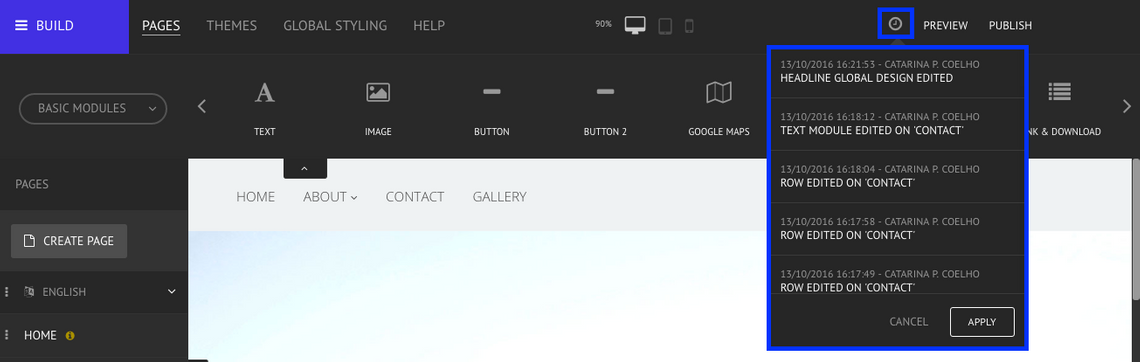
The Rollback function is symbolized by a little clock icon and can be found on the upper right corner of the editor, to the right of Preview and Publish. This functions allows you to visualize the last 30 changes done on your website, chronologically ordered from the newest to oldest, and restore any of these versions.
HOW TO USE THE ROLLBACK FUNCTION
Click on the Rollback icon and a dropdown list with the last 30 changes will show up underneath. Find the change you wish to undo and, by clicking on it, a preview of the website from the time of that specific change will appear in the main area of the editor.
You are now able to scroll up and down to explore that version of the website. If that is the version you wish to restore, just click on Apply and all the changes made after that version will be gone.
If you wish to look at another change, you can easily do so by finding it and selecting it from the dropdown list. If you no longer wish to undo any change or you want to go back to the editor without applying any changes, click on Cancel.
It's important to remember that this Rollback function is not specific to you, as a user. If somebody else is able to log into this site to edit it - they will see the same list of rollback options, and can revert any of the last 30 changes that have been made, not just the changes from one specific user. It is also possible to check the login name of the person that performed each change.
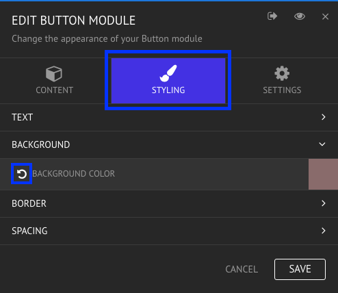
1.14 Reset Function
When styling an element you will see the Reset icon on the left side of an option. This function allows you to reset a specific element to its original design, (the design that comes when the module is created in the first instance).
HOW TO USE THE RESET FUNCTION
Under the styling tab of an element, if you hover the cursor on top of any option, the Reset icon shows up on the left. Click on it if you wish to revert the styling of that element and don't forget to click on Save to apply the changes or cancel if you no longer wish to modify the element. Bear in mind, this will remove any styling you may have applied here.
General Settings
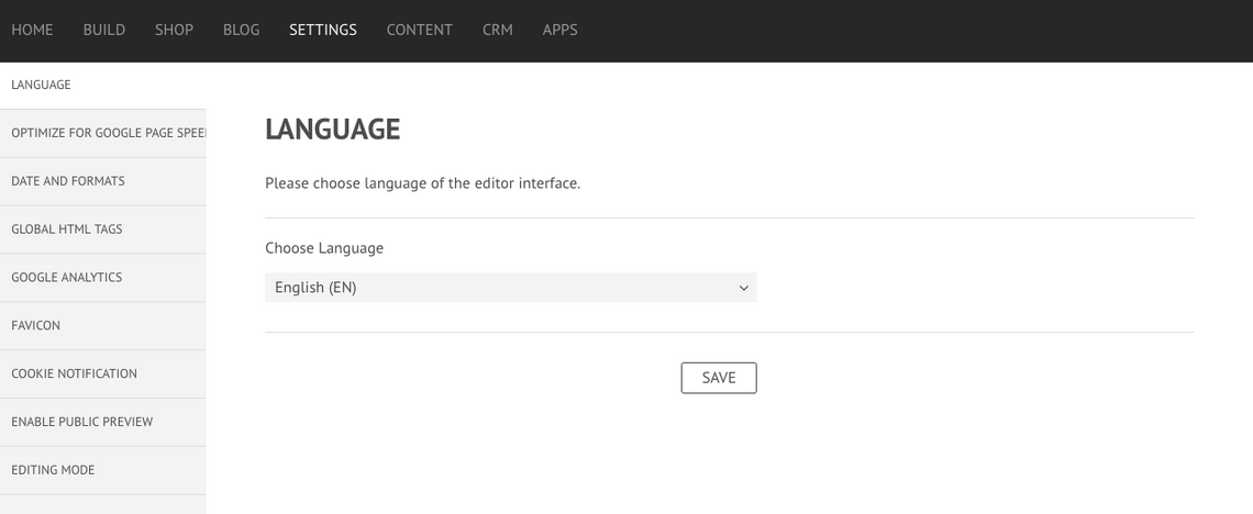
2.1 Editor Language
This setting will allow you to change the language of the editor.
HOW TO SELECT AND CHANGE LANGUAGE
In the editor, click Settings and choose the Language option. It is possible to select a preferred editor interface language by using the dropdown menu. Apply the change by clicking on the Save button.
Your editor interface language should be updated automatically. You may have to log out and log in again to force the update if it does not change immediately.
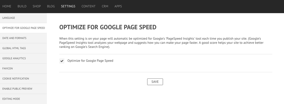
2.2 Google Page Speed
When this setting is on, your page will automatically be optimized for Google's 'PageSpeed Insights' tool each time you publish your site. This tool analyzes your webpage and suggests ways in which you can make your page faster. A good score helps your site to achieve better ranking on Google's search result pages.
HOW TO OPTIMIZE FOR GOOGLE PAGE SPEED
In the editor, click Settings and choose the option Optimize for Google Page Speed. Check the field Optimize for Google Page Speed and press the save button.
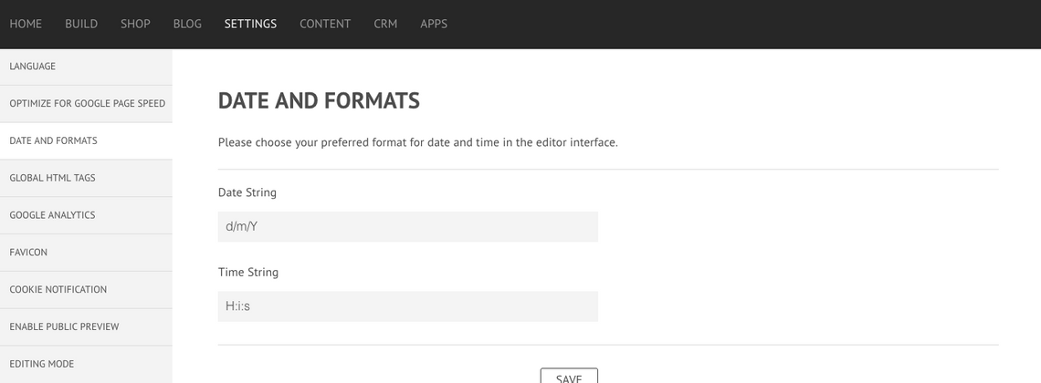
2.3 Date and Formats
This setting allows you to edit the date and time formats.
HOW TO SET THE DATE AND TIME FORMATS
In the editor, click Settings and choose the Date and Formats option. Set the preferred Date String and Time String and finish by clicking the Save button.
Your editor date and formats will be updated immediately.You may have to log out and log in again to force the update if it does not change automatically.
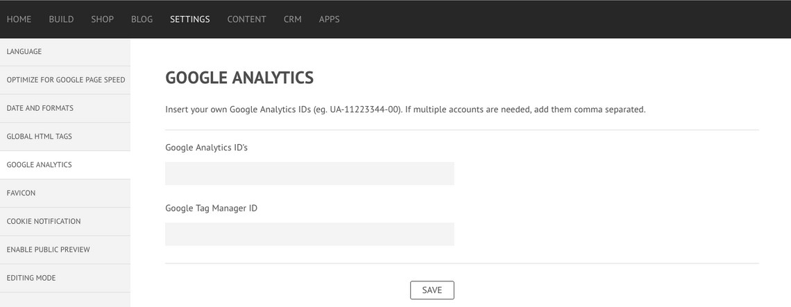
2.4 Google Analytics
Google Analytics is an important tool that allows you to track, monitor and analyze your traffic and understand your visitors. The editor allows you to export a full range of highly detailed statistics about your traffic and visitors to your own Google Analytics account.
HOW TO ADD AN ACCOUNT
To add a Google Analytics account, simply add your Google Analytics ID and the Google Tag Manager ID in the fields. It is possible to add multiple accounts by separating the IDs with a comma.
QUICK STATISTICS
For a quick overview of some important statistics, don't forget to check the Visitor Stats on the Home tab of the editor. Learn more about the editor statistics section here!
2.5 Favicon
You can easily add your own unique favicon. The favicon sits in the browser bar, to the left of the title, and also appears in bookmark listings.
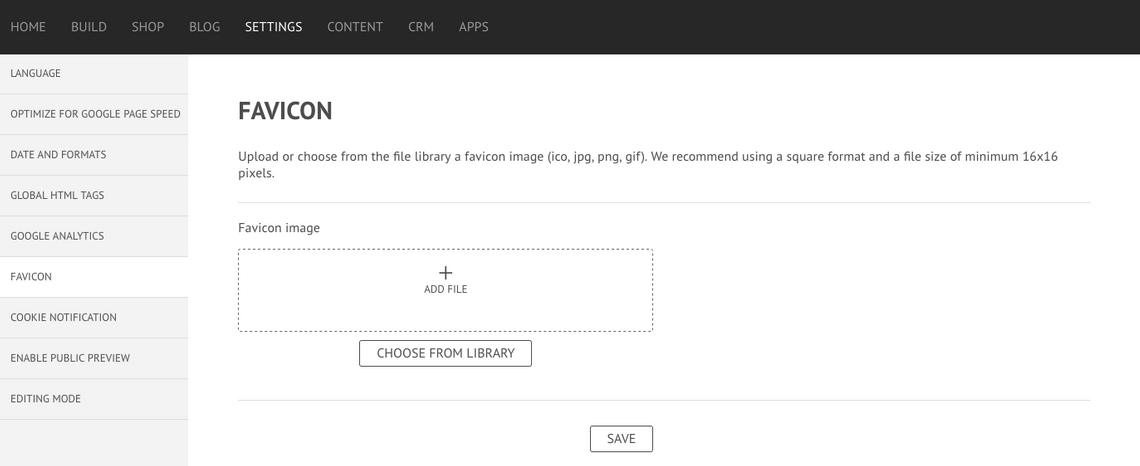
HOW TO ADD & EDIT A FAVICON
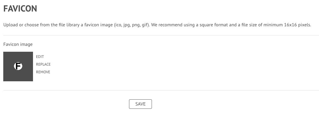
In the editor, click Settings and choose the Favicon option. Upload your favicon file or select it from your Image Library and finish by clicking on the Save button.
Your favicon will be visible in the browser tab when the site has been published.
BEST PRACTICES
IMAGE SIZE & SHAPE
The ideal image size for a favicon highly depends on the browser and on the platform. However, we recommend the use of a square format and a file size of minimum 16x16 pixels. For high resolution displays and high-density screens you may wish to try 64x64 pixels or above.
DETAILS
As mentioned above, the favicon is yet another source of branding and identification for your clients. However, given its small dimension, you must take into consideration that highly detailed pictures would look quite confusing. When designing your favicon, keep it simple! Use your logo or a minimalist picture that represents your business. Most browsers will still display the favicon at around 16x16 pixels.
TRANSPARENCY
One commonly found feature on most favicons is their background transparency. This helps it blend nicely with the browser background, without creating awkward contrast or edges. Note the difference in the example below - the favicon with the transparent background looks significantly more professional than the one with the white background. Keep this in mind when designing your own favicon.
2.6 Cookie Notification
Enable the top bar overlay to greet your website visitors with a message about accepting or disallowing tracking cookies. Disallowing cookie tracking will ensure that the visitor’s actions on your website are not recorded or captured in your analytics dashboard.
HOW TO MANAGE COOKIES
In the editor, click Settings and choose the Cookie Notification option. Activate a cookie notification info bar by check marking the "Enable info-bar on top of your site" function.
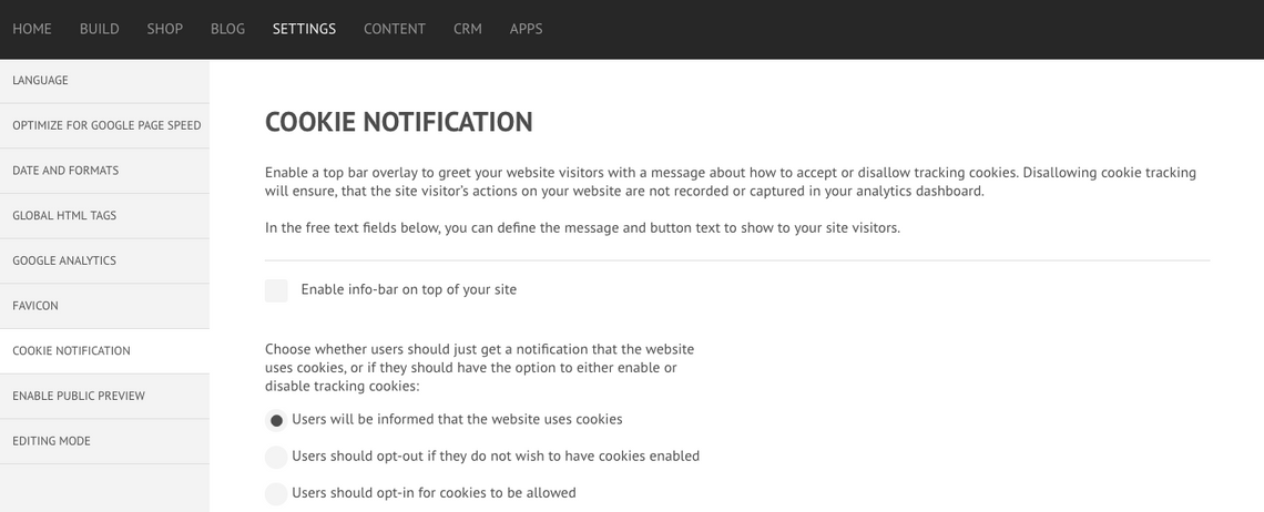
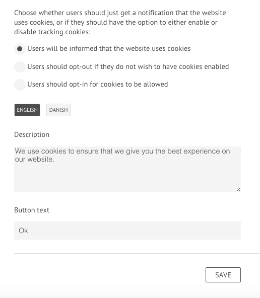
TYPE OF NOTIFICATION
It is possible to choose whether Users will just be informed that the website uses cookies or if they should be able to take action such as opt-out if they do not wish to have cookies enabled or if Users should actively opt-in for cookies to be allowed. These settings are sensitive to local privacy and cookie laws. Please check with your local legal policies in order to determine which setting is best for your website.
CREATING THE MESSAGE AND BUTTON TEXT
You may create the message and define the button text to show to your site visitors under "Description" and "Button Text", as illustrated in the image below.
CONTENT
3.1 Global Data
Global data is a powerful and time-saving feature that allows you to reuse common and important business information as short cuts, saving you time when adding and editing your website content.
With global data you only need to enter the information once. The information will then be automatically populated in all the relevant modules on your site that refer to these global data nodes.
What's more, when you make an edit to any piece of global data, this update automatically displays anywhere this data item is placed within the website. Read all about Global Data here!
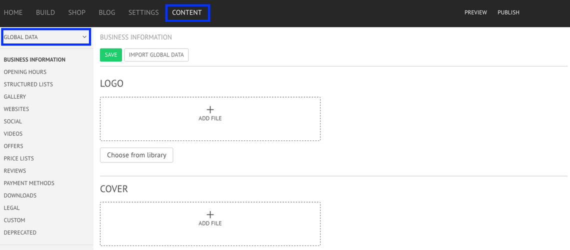
HOW TO ADD GLOBAL DATA
You can find Global Data in the left side menu under the Content Tab of the editor. Under Global Data you can find the following fields: Business Information, Price Lists, Gallery, Opening Hours, Reviews, Social, Websites, Downloads, Videos, Payment Methods, Custom, Structured Lists, Offers and Deprecated. Fill in the relevant fields and once you have completed them you can use them on your website as many times as you want.
IMPORT CONTENT
Instead of manually adding the content, the editor gives you the possibility to import content from existing websites and add it to your own. This feature is available for Business Information, Custom and Deprecated sections. Learn how to import content for global data here!
HOW TO USE GLOBAL DATA
It is possible use Global Data in many different elements once you have completed the necessary fields. You can always add Global Data on the Text Module, the Image Module, the Google Maps Module, the Social Media Module, the Gallery Module, among many other uses.
Global Data makes easy the introduction of content without actually writing it - simply by using the Global Data tags, which you can always modify before using.
3.2 File Manager
The File Manager functions as a media library for your stock images, pictures and downloadable files. With this tool it is possible to add, edit and delete files.
The File Manager can be found on the left side menu of the Content tab of the editor but all files are then accessible in the Build area of the editor when working with relevant functionality (e.g. adding a background image to a row, adding a file to the download module, etc.).
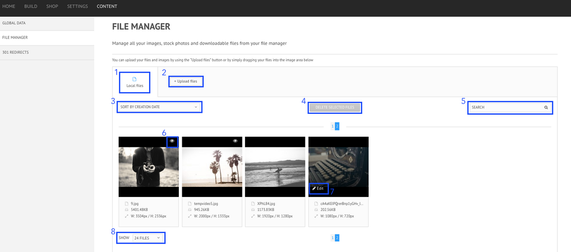
1. LOCAL FILES
The Local Files tab shows existing uploaded files, to which you can add more or edit/delete.
2. UPLOAD FILES
To upload a new file, click on + Upload Files and choose the file you wish to upload from your computer locations. Alternatively you can just drag the file you wish to upload into the image area available.
3. SORT BY
To organize the files in a more effective manner, it is possible to sort the order in which they appear in the manager. It is possible to sort the files by creation date, name, type, size and how commonly used they are.
4. DELETE FILES
To delete a file, click on it to select it - the image should be outlined in green. You can select multiple files in this way and to delete them just click on the Delete Selected Files button on the top of the File Manager.
5. SEARCH
Once you have a large and complete library, it might become difficult to look for a specific image or file. This tool allows you to search your whole library based on the complete or partial file name.
6. USE ON PAGE
On the upper right corner of the picture you can find a visibility icon. By hovering over it, a message box should state where on your website is that file being currently used on.
7. EDIT FILES
To edit a file, hover on the image you wish to edit. Click on the Edit icon that shows up on the bottom left corner of the picture and an editing menu appears. Don't forget to click Save Changes to apply the modifications and close the editing menu.
DESCRIPTION ALT TEXT
In this section it is possible to add the picture Alt Text. To learn more about what Alt Text is, please click here.
KEYWORDS
The keyword section is an easy way to organize your files by attributing them keywords. Once you are using the Search tool, you can look for the specific terms in order to get better results.
AUTHOR
In this section you can add the author of the file.
8. SHOW
To improve the visualization of the files, it is possible to choose the number of files you wish to be shown on each page. You can choose between showing 24, 50, 100 or all the files on one page.
FILES SUPPORTED
The following list represents all the extensions supported by the File Manager: jpeg, jpg, gif, png, svg, ico, pdf, docx, doc, odt, rtf, txt, csv, pps, ppt, xml, xlsx, xls, js and css. Please note that the File Manager upload limit is 20 MB.
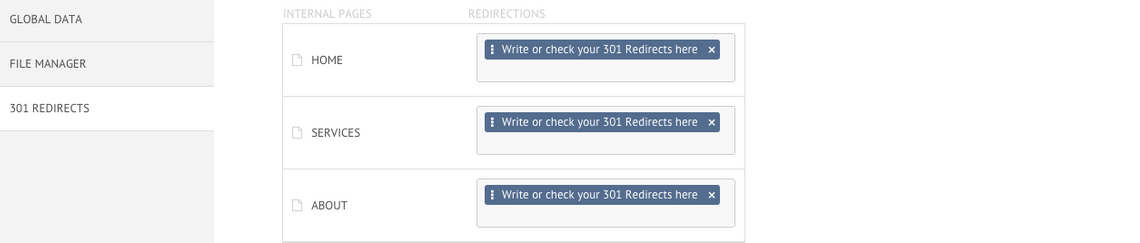
3.3 301 Redirects
A 301 redirect is a permanent redirect from one URL to another. In this section it's possible to manage all your 301 redirect rules from one place.
SEARCH URL
This tool allows you to search for a current page on the website and in return it shows you all the existing 301 redirected URLs for that page. It is then possible to drag them to the Redirections box to turn them into redirections to a specific page of your website.
INTERNAL PAGES & REDIRECTIONS
This section shows your current pages and all the links that are redirecting to each page. It is possible to manage your redirections - add more, delete existing ones or drag them from one page to the other.
PRODUCTS & BLOG POSTS
If a site owner already had blog posts or e-commerce products on another platform, it is also possible to specify a redirect for each specific product or blog post to the new site, maintaining the SEO value. Click here to read more about 301 redirects for products and for blog posts.
Previewing & Publishing
4.1 How to Preview Website
At any given time, the editor gives you the possibility to preview the website so you can have a global picture of what you are designing and test tools that don't show while building the pages, e.g the Fix Header to Top option.

HOW TO PREVIEW THE WEBSITE
You will find the Preview option in the upper right corner of the editor. Once you click on it, a new tab with the preview of your website will appear in the different viewports. Feel free to scroll down and explore the website, including testing some elements. If you wish to preview the website full-screen on your desktop, simply click on "Remove Frame" in the top right corner.
Once you have seen all you have wanted, you can close the tab and keep working on the editor.
4.2 How to Publish the Website
You should only publish your website once you are totally finished and want to put it live and online.
HOW TO PUBLISH THE WEBSITE?
To publish your website, find the Publish option on the upper right corner of the editor. Once you have clicked on it, a pop up menu will appear asking you if you are sure you want to publish. By clicking Yes, a new notification will appear and you may have to wait while the the images are being generated.
Once the images have been successfully generated, a link will be provided where you can visit your website.

Pages & Content
5.1 Create a new page
It is very easy to add a new page in the editor. In the Page Tree area click on the button Create Page, after which a new page menu will show up to allow you to add the relevant details.
PAGE NAME & PAGE URI (URL)
In this section you can name your new page and decide on its URI (or URL), which is the individual page address. The Page Name is what appears in the page tree navigation in the editor but also the Menu headings and breadcrumbs on the the website navigation.
By default, the URI will automatically complete itself using the page name but it is possible to change it if desired. Note that if you change the page name at any point it will update the URI so if you wish to keep the URI the same despite changing the page name you'll need to manually enter it again after you update the page name.
Please note that the page URI can only contain lowercase English letters, numbers, underscores and dashes.
TEMPLATE LAYOUT
When creating a page you don't have to start from scratch. Under the Template Layout section, it is possible to choose how the new page is going to look - Frontpage, About, Contact, Product/Service, Gallery or Blank.
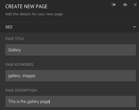
SEO
- PAGE TITLE, KEYWORDS AND DESCRIPTION
It is possible to add elements to each page of the website to aid with search engine optimization. Add a Page Title, Keywords and Description to optimize your website for search engines (remember, keywords are generally no longer a ranking factor for search engines). When you have completed and saved it, make sure you have a H1 headline on the page as well as ALT texts defined for all the page's images and the little yellow warning next to the page title should disappear.
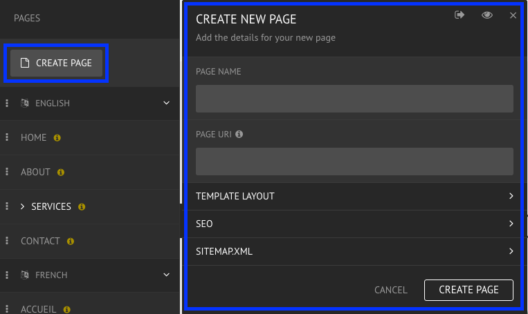
- DON'T INDEX THIS PAGE
When this option is enabled, search engines won't index the page, preventing it from being added to their index, and as a result the search results pages.
- 301 REDIRECTS
A 301 redirect is a permanent redirect from one URL to another. On this section, it is possible to write one or more URLs to redirect to the page just created. To find more about 301 Redirects, click here.
SITEMAP.XML
The Sitemap is a file that indexes all the URLs on a website. Search engines use it to make sure they have all the right pages indexed and the right structure in place. In this section, it is possible to choose the page priority, how important this page is in relation to other pages on the website, and the Change Frequency (how often the page may change).
5.2 Add Sub Page
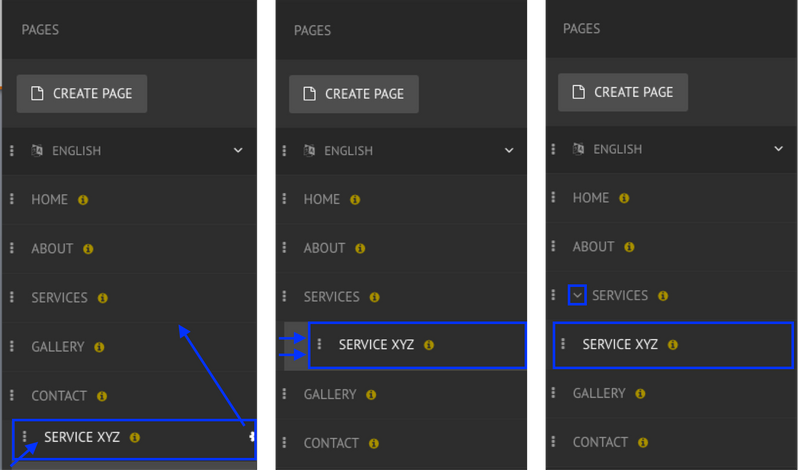
The Page Tree works as a hierarchical navigation system in which you can have pages and sub pages.
HOW TO ADD A SUB PAGE?
When you have added a page you can add it as a sub page to an existing one. To do so, drag the sub page to the page you want it to sit under and make sure it appears indented to have it sit within the hierarchy as a child page.
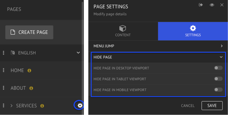
5.3 Hide a Page
Sometimes it makes sense to hide a page. The editor allows the choice of which pages to hide and to which viewport.
HOW TO HIDE A PAGE
To hide a page, hover the mouse on the page you wish to hide and click on the Settings icon. Under the Settings tab on the Page Settings menu, the option to Hide Page can be found - from there it is possible to choose which viewports the page be hidden from.
Hiding a page does not stop people from visiting it if they know the correct URL.
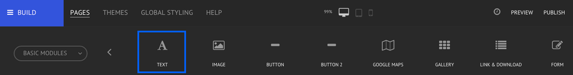
5.4 Add Text
The Text module makes it easy for you to add and edit text to your website. It is possible to find the Text Module in the Basic Modules menu, add it to your website by dragging it from the top bar to a row or column of your preference.
EDIT THE TEXT MODULE
To open the editing menu, double-click on top of the text you wish to modify or hover the mouse on top of the module to find the blue module menu, and click on the Edit option.
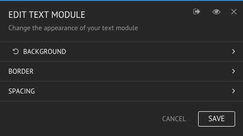
- BACKGROUND
There are two options when changing a text module's background - choose a solid color or upload an image from your computer or from the library.
- BORDER
Personalize your text module's border by choosing a color, width and style.
- SPACING
When styling the text module there are two spacing settings available: margin - which adjusts the space outside of an element; and padding - which adjusts the space inside of an element.
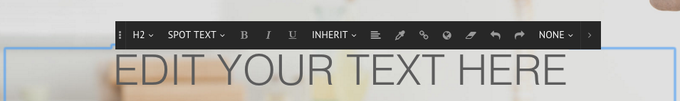
WRITE AND STYLE TEXT
Click once on top of the Text Module to activate the editing text function, where you can type freely, and the Text Editor Toolbar, which allows you to style the text in many different ways. To learn more about each function of the Text Editor Toolbar, please click here.
5.5 Add Images
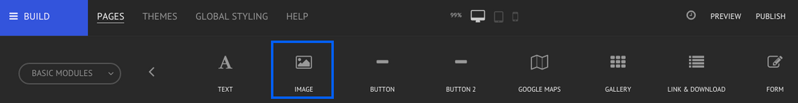
There are many great ways to add more visual elements to a website - the Image Module can help with that - both with still and animated images (GIFs). It is possible to find the Image Module in the Basic Modules menu, add it to your website by dragging it from the top bar to a row or column of your preference.
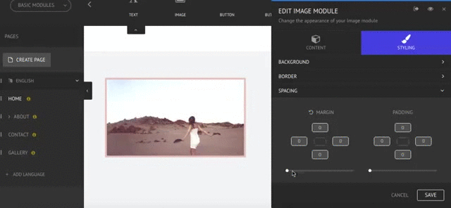
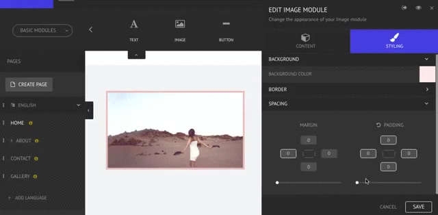
EDIT THE IMAGE MODULE
To open the editing menu, double-click on top of the image module you wish to modify or hover the mouse on top of it to find the blue Module menu and click on the Edit option. The Edit Image Module menu is separated into content and styling.
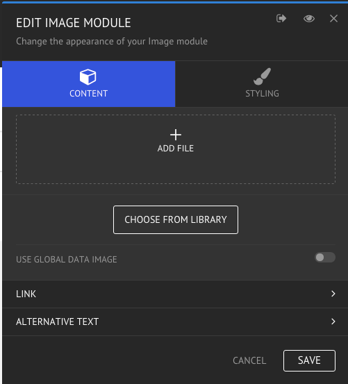
CONTENT
- ADD FILE / CHOOSE FROM LIBRARY
There are two main ways to add an image - either by uploading it from your computer or by using the File Manager. To learn more about uploading options, please click here.
Image Editor: Once you have uploaded an image, it is possible to adjust it in terms of filters, orientation, size and many other options. To do so, click on Edit by the right side of the uploaded picture and the Image Editor should open straight away. To learn more about each function of the Image Editor, please click here.
- USE GLOBAL DATA IMAGE
Instead of manually uploading images, you can use images you have previously uploaded to your Global Data. It is also possible to change its size, placement and alignment. To activate this option, simply toggle on in the right side. When you use the Global Data Image you only need to upload the images once and you could then use it on your website as many times as you want. Learn more about Global Data here!
- LINK
It is possible to associate a link to an image so it behaves in a specific way when an individual clicks on it. You can choose what kind of link you want to add - an external page, an internal page, an email or a file. To learn more about linking images, please click here.
- ALTERNATIVE TEXT
ALT-Text is an alternative to an image; defining an image ALT-Text will guarantee that the website is still readable and consistent. To learn more about Image ALT-Text, please click here.
STYLING
With this feature it is possible to customize a picture's background, borders and spacing by changing the appearance of the Image module. To learn more about styling options, please click here.
5.6 Add Button
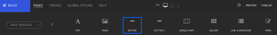
Buttons make it easy for your visitors to find the information they need and is also an effective way to encourage them to visit specific pages on your website. It is possible to find the Button Module in the Basic Modules menu, add it to your website by dragging it from the top bar to a row or column of your preference.
EDIT THE BUTTON MODULE
To open the editing menu, double-click on top of the button you wish to modify or hover the mouse on top of it to find the blue Module menu and click on the Edit option.
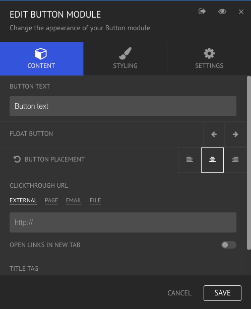
CONTENT
- BUTTON TEXT
In this box you should type the text you wish the button to display.
- FLOAT BUTTON & BUTTON PLACEMENT
With these options you are able to place a button in your preferred location - right, center or left.
- CLICKTHROUGH URL
In this section it is possible to define the behavior of the button - linking it to an internal page, an external page, an email or a file. It is also possible to define whether the link should be opened in a new tab or not; note that by default, external links are always set to open in a new tab.
- SET "NOFOLLOW" PROPERTY
In this section it is possible to set a "nofollow" property to that specific link. This is a particularly relevant setting if you do not want search engines to consider that hyperlink and, therefore, when this setting is enabled, your link will not affect the target's ranking in the search engine index.
- TITLE TAG
The Title Tag tells people and search engines what that page is about. It should contain relevant keywords given that this element is part of what makes people want to visit your site when it shows up in search results.
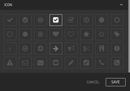
- ICON
It is possible to add a small icon to your button. Simply choose your preferred icon from the list and select it to add it to your button; to remove the icon, simply select it again until it is no longer highlighted.
STYLING
- TEXT
When styling the button's text you can define the font color, size, height, family, weight and alignment.
- BACKGROUND
With this option you can choose a solid color as the background for the button.
- BORDER
Here you can define the border color, width, style and radius of the button.
- SPACING
When styling the spacing you can define the margin - which adjusts the space outside of an element; and padding - which adjusts the space inside of an element.
- ICON STYLE
When styling the icon it is possible to define its size, color and spacing, both in terms of margin and padding.
SETTINGS
- TRACKING
With the editor it is possible to track your visitors behavior regarding that specific button. Attribute a custom tracking name to the button in the field and you will be able to track its action and statistics on the Home dashboard of the editor, under Custom Actions. Read more about Visitor Statistics here!
BLOG
6.1 Blog Fundamentals
Blog is an essential and exciting feature to add to your website. The blog should be used as a communication channel for your clients and visitors. To have a blog on your website you must add and manage your Blog Posts and then add them to your website through the Blog Catalog Module.
ADD & MANAGE BLOG POSTS
Adding and managing blog posts is done on the Blog tab of the editor. Here you can add posts, manage tags, handle comments and define settings. Learn how to add blog posts here!
BLOG CATALOG
Display posts on your website by using the Blog Catalog Module. Learn how to add and style the Blog Catalog here!
BLOG POST PAGE
Once a visitor clicks on a post on the Catalog, they will be redirected to the post page, where the post, its attachments and comments fill the whole page.
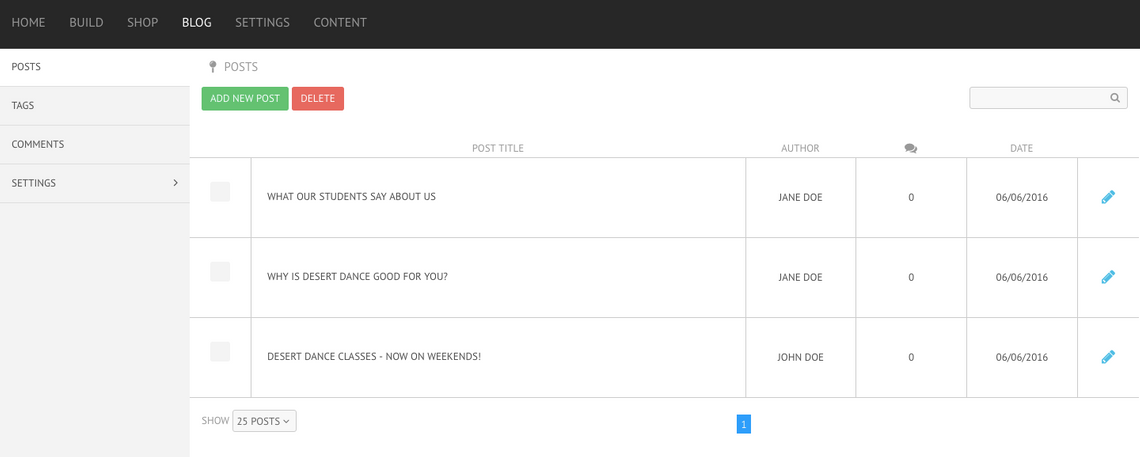
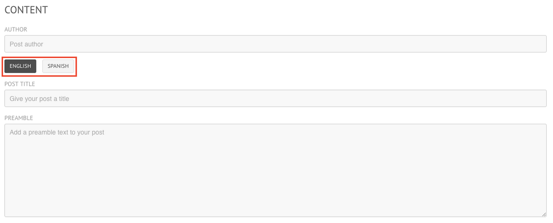
6.2 Add New Post
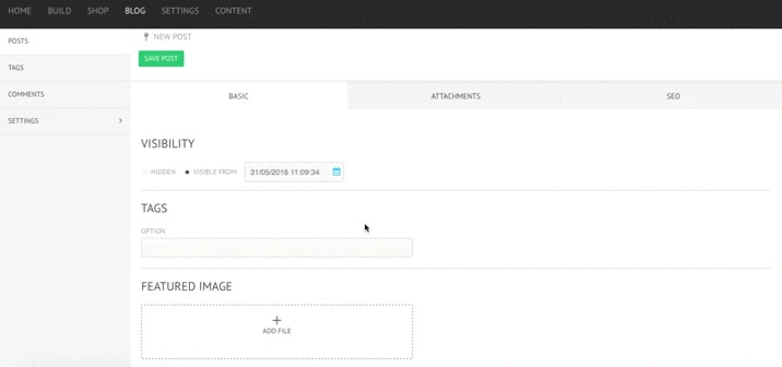
Creating posts is easy with the blog editor. It is possible to find the Posts section on the left side menu of the Blog tab. To add a new post, simply click on the Add New Post button. A new menu with three tabs will appear - the following article will go through the Basic tab.
VISIBILITY
This feature allows you to define the visibility of your post, this means whether the post will be shown on the blog to your visitors or not. You can hide it or make it visible from a specific date. By default, the post will be visible from the moment of creation.
TAGS
Tags are extremely useful to organize and display your posts on your blog, thus make sure to add in this section as many tags as you wish, as long as they are relevant to the post and its content. Keep in mind that tags must be a single word or words with no spaces in between. Learn more about Tags here!
FEATURED IMAGE
The featured image will be the main image associated with the post. To add an image, simply click on Add File or drag your preferred image into the box, in case the image is in your computer, or click on Choose From Library, in case you have uploaded the image to your File Manager already.
- EDITING
Once you have uploaded the image, you can use the integrated image editor to alter your image - crop, change orientation, add filters, among other options. Learn everything about the Image Editor here!
- REPLACE & REMOVE
If you are not happy with the image you have uploaded, you can easily replace it or remove it by clicking on the respective button.
CONTENT
- AUTHOR
In this section you should add the name of the author of the post.
- POST TITLE
Choose a title for your post and write it down in this section.
- PREAMBLE
The preamble is the first text that your visitors will see when reading your post. It is also the only text shown on the preview, on the Blog Catalog. Therefore, the preamble should be used as the introduction to the post.
- CONTENT
Finally, on the content section you should add the actual post. When typing down your blog preamble and content you will find a simplified version of the text editor toolbar in which you can add styling to your blog post. Read more about the text editor toolbar here!
DIFFERENT LANGUAGES
The editor also offers you the possibility to have the translation for each post on the different languages that your website supports. To do so, simply click on the language you wish to write in and complete the post title, preamble and content fields in the new language. The blog catalog will automatically display the posts in the language of the pages where it is included - e.g. by dragging a blog catalog into any spanish page, the posts will automatically be displayed in spanish. Learn how to add a new language here!
6.3 Blog SEO
The blog is built to boost SEO. It is possible to add SEO elements to each post, optimizing it for a search engine. You can find SEO as the last tab when adding or editing a post.
TITLE
By default, the title will be the same as the title of your post but it is still possible to edit the title as you wish.
DESCRIPTION
By default, the description will be the content part of your post. You can easily edit it by deleting or adding text on the box. Note that on a search engine the description gets cut off after 160 characters, so try to keep it interesting, brief and relevant to your post.
KEYWORDS
Add the relevant keywords regarding your post in this section.
PERMALINK
Create your own individual permalink for each post or let the editor generate one for you. The editor generates the permalink based on the post title.
301 REDIRECTS
If you already had blog posts on another platform, it is possible to specify a redirect for each blog post to your new site, maintaining the SEO value. Read more about 301 Redirects here!
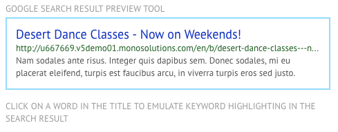
PREVIEW
As you're filling in the fields, you'll be able to preview what your post would look like on a Google search through the Google Search Result Preview Tool. Here you can also click on a word in the title to emulate keyword highlighting in the search result.
6.4 Add & Manage Category Tags
Category tags are useful when you want to organize your posts. In this section you can have an overview of your existing tags and which posts have been tagged with each one of them. Find the Tags option in the left side menu of the Shop tab of the editor.
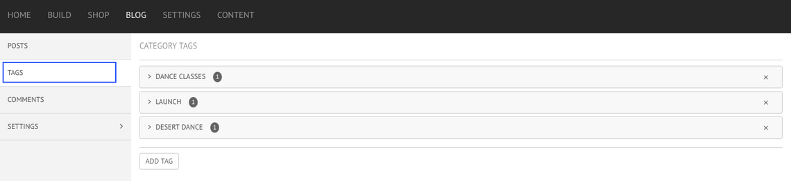
CATEGORY TAGS
In front of each tag, the small number represents the number of posts to which that tag has been attributed to. By clicking on top of each tag you'll be able to see which posts exactly have that specific tag.
ADD TAG
In this section you can also add more tags, by clicking on the Add Tag button on the bottom of the page. Keep in mind that tags must be a single word or words with no spaces in between.
DELETE TAG
To delete a tag simply click on the X icon on the right side of each tag.
ADD TAGS TO POSTS
When adding or editing a post, you can add a tag under the Basic tab. By clicking on the field, all the existing tabs will appear below - add them to the post by clicking on top of each. Alternatively, type down the tag you want to add and it will be automatically saved in the Category Tags for future use.
APPLY CATEGORY TAGS
Tags are useful when you are setting up and organizing your Blog Catalog. To read more about the Catalog Module, click here!
6.5 Blog Catalog Module - Content
When editing the blog catalog, content is the first group of settings you can define.
BLOG POSTS
- BLOG POST TAGS
By default, your Blog Catalog will show all your posts, with the most recent being shown first; so this is the Catalog behavior if this field is left blank. However, you can choose to show a specific group of posts; to do so, type in the field the tag(s) of the posts you wish to display. This means that if you want a specific group of posts to show in your blog, you have to tag them while creating them and use the same tag when setting up you Blog Catalog.
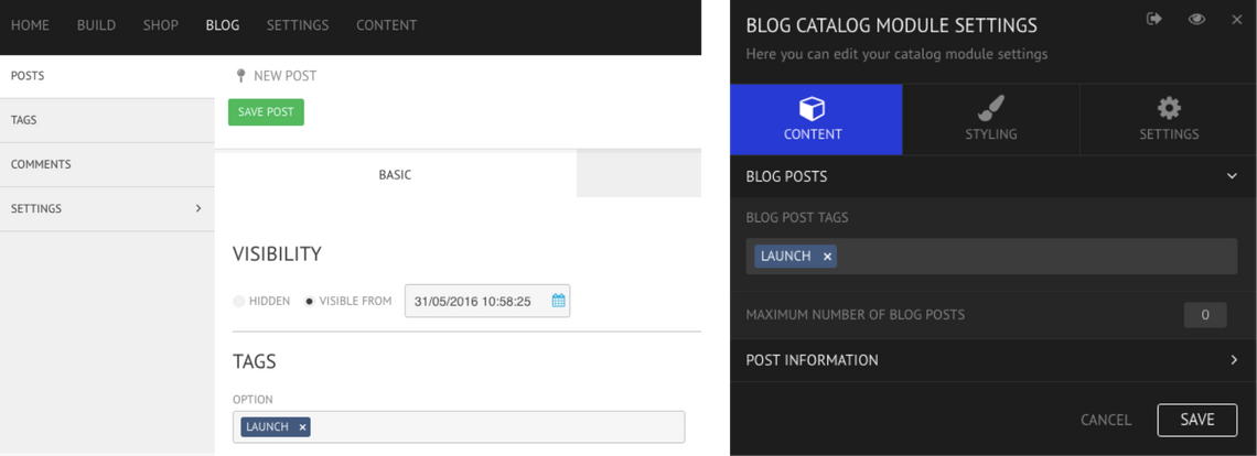
Example: If from all my posts, I wish to only display those that mention a product launch, then I must have tagged all those posts with the tag "launch" and I should type that tag on the Blog Catalog Module Settings as well.
- MAXIMUM NUMBER OF BLOG POSTS
In this field you can define the maximum number of posts you wish the blog catalog to display. Write the number down on the box or use the slider to increase the number of posts shown. If you make no alterations, the catalog will show as many posts as there is on that tag; or in case you haven't selected any tags, it will show all your posts.
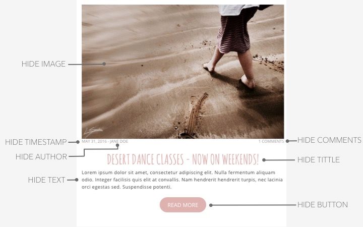
POST INFORMATION
This group of settings refer to the Blog Catalog, which means it only affects the Catalog and not the individual post page.
- HIDE IMAGE
Enable this option to hide the featured image on top of the post.
- HIDE TIMESTAMP
Enable this option to hide the time of creation of the post, which is located directly below the featured image.
- HIDE TITLE
Enable this option if you wish to display posts without title.
- HIDE TEXT
Normally the Catalog displays the preamble, by enabling this option, the catalog will hide the text, in this case, the preamble.
- HIDE AUTHOR
Enable this option if you wish to hide the author name, which is located directly below the featured image.
- HIDE COMMENTS
Enable this option if you wish to hide the number of comments on each post.
- HIDE BUTTON
Enable this option if you wish to hide the "Read More" button. The post page will still be accessible by clicking on any other element, e.g post title or featured image.
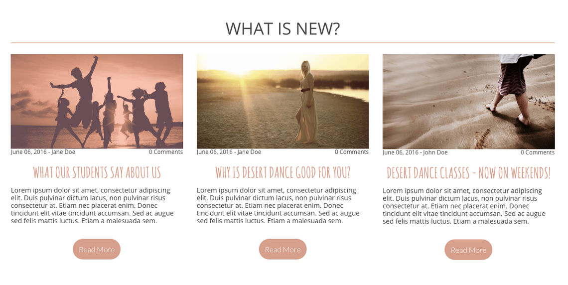
OVERVIEW
The image below represents the elements that would be affected by the settings done on Post Information.
6.6 Blog Catalog Module - Settings
When editing the blog catalog, Settings is the last group of settings you can define.
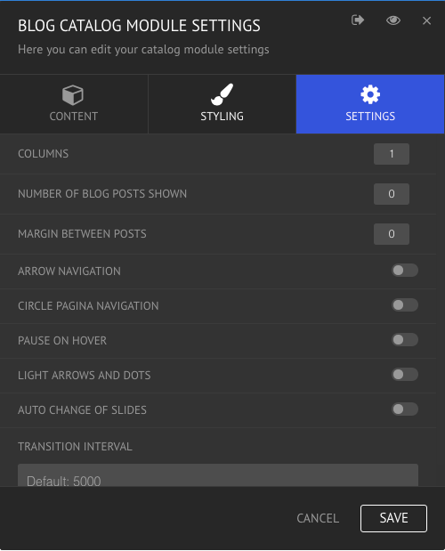
COLUMNS
Decide the number of columns the blog catalog will have. Write them down in the box or use the slider moving it to the left or right to decrease or increase the number of columns, respectively.
NUMBER OF BLOG POSTS SHOWN
This will ultimately dictate how many posts are shown, given the amount of columns. For example, if you want 12 posts to be displayed and you have chosen 4 columns, the catalog will automatic design 3 rows.
Note: The blog catalog will only display your visible posts on the moment of editing. This means that hidden posts or posts which visibility are scheduled for a future date, won't be shown. Learn how to define the visibility of your posts here!
MARGIN BETWEEN POSTS
Choose how big the margin between posts should be. Write it down in the box or use the slider moving it to the left or right to decrease or increase the margin size, respectively.
ARROW NAVIGATION
When this option is enabled, the navigation between posts of the blog catalog will be done through an arrow on each side, moving the posts on the respective direction.
CIRCLE PAGINA NAVIGATION
When this option is enabled, the navigation will be done with circles (dots) on the bottom of the catalog.
PAUSE ON HOVER
When this option is enabled, the slides will stop automatically changing if someone is hovering their mouse over the posts. Once they hover somewhere else in the page, the slides will go back to automatically changing.
LIGHT ARROWS AND DOTS
By default the navigation arrows and dots are dark colored but by enabling this option they get recolored into a lighter color.
AUTO CHANGE OF SLIDES
When this option is enabled, the navigation in the catalog will be done automatically. The group of posts shown will automatically change, sliding to the side and showing the next group of posts.
TRANSITION
With this option you can define the transition animation for your catalog - "slide", in which each slide moves horizontally; "slow fade", in which the slide fades for 800 milliseconds; and "fast fade", in which the slide fades for 200 milliseconds.
TRANSITION INTERVAL
By default the transition interval is 5000 milliseconds. Choose a smaller value if you want the transition interval to be shorter and a bigger value if you want the transition interval to be bigger.
APPS
7.1 Facebook App Manager
The Facebook App Manager allows you to easily integrate your website with your Facebook page. It is possible to automatically synchronise your site's pages and global data to your Facebook page. Find the Facebook App Manager under the Apps tab.
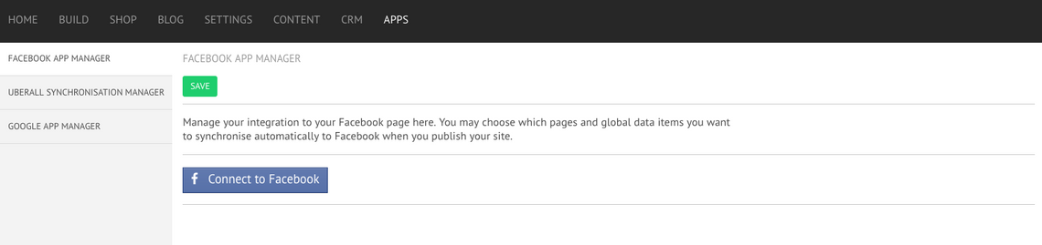
CONNECT TO FACEBOOK
The first step should be to connect to Facebook. By clicking on the button you will be redirected to your Facebook where you have to allow the editor to synchronise with the social media site. Once you have logged in you will find:
- CONNECTED TO FACEBOOK AS:
In this section you can see which Facebook profile is connected with the editor.
- DISCONNECT
You can disconnect from Facebook at any time. Press the Disconnect button to do so.
- SELECT A PAGE
Choose from the dropdown menu the Facebook Page that you wish to synchronise with your site.
SYNCHRONISATION SETTINGS
The Facebook App Manager imports content from your site and adds it to your Facebook Page. In this section you will find a long list of Global Data fields that you can synchronise to your Facebook page. The first option will enable the synchronisation of global data and pages to your Facebook page; this means that it is possible to temporarily disable the sync while maintaining the connection to the Facebook page - toggle on if you wish to keep the synchronisation and off if you want to momentarily stop it. You can then select which global data fields you want to import. Simply toggle on in front of each option.
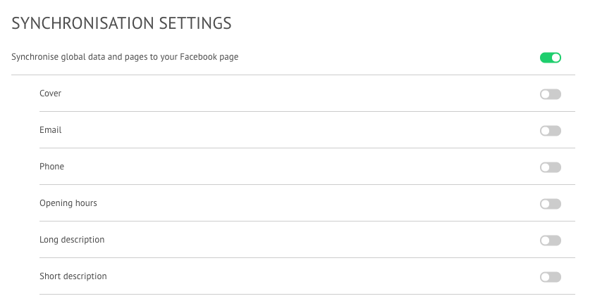
- GLOBAL DATA FIELDS
The Global Data fields that you can choose to synchronise are: cover picture, email, phone, opening hours, long description and short description. Don't forget to add and verify if this data is correct under Global Data. Learn all about Global Data here!
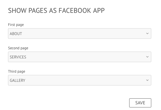
SHOW PAGES AS FACEBOOK APP
When managing your Facebook page, it is possible to see what tabs your visitors can see. The tabs are shown on the menu on the left side, below your profile picture. With the Facebook App Manager you can show up to three pages from your site directly on Facebook as a page tab. These will be shown on an “iframe”, which means they will look and feel just like your site; and if you update your site, they will automatically display the changes as well.
GOOD TO KNOW
The content of the pages, you have selected, is mirrored on Facebook.
Pages are shown in tablet view on Facebook because of Facebook's size restrictions.
On site publish, global data is updated to Facebook (except when page has been set to "not publish")